> For the complete documentation index, see [llms.txt](https://acoservice.gitbook.io/acoservice-documentation/llms.txt). Markdown versions of documentation pages are available by appending `.md` to page URLs; this page is available as [Markdown](https://acoservice.gitbook.io/acoservice-documentation/for-tenant-admins/branding.md).

# Branding

Set your group's name, logo, favicon and colour palette, and choose whether the site opens in light or dark.

**Admin → Branding** is where your site stops looking like everyone else's. It sets the wordmark, the logo and favicon, the colour palette the whole site is painted from, and which mode — light or dark — a visitor sees first.

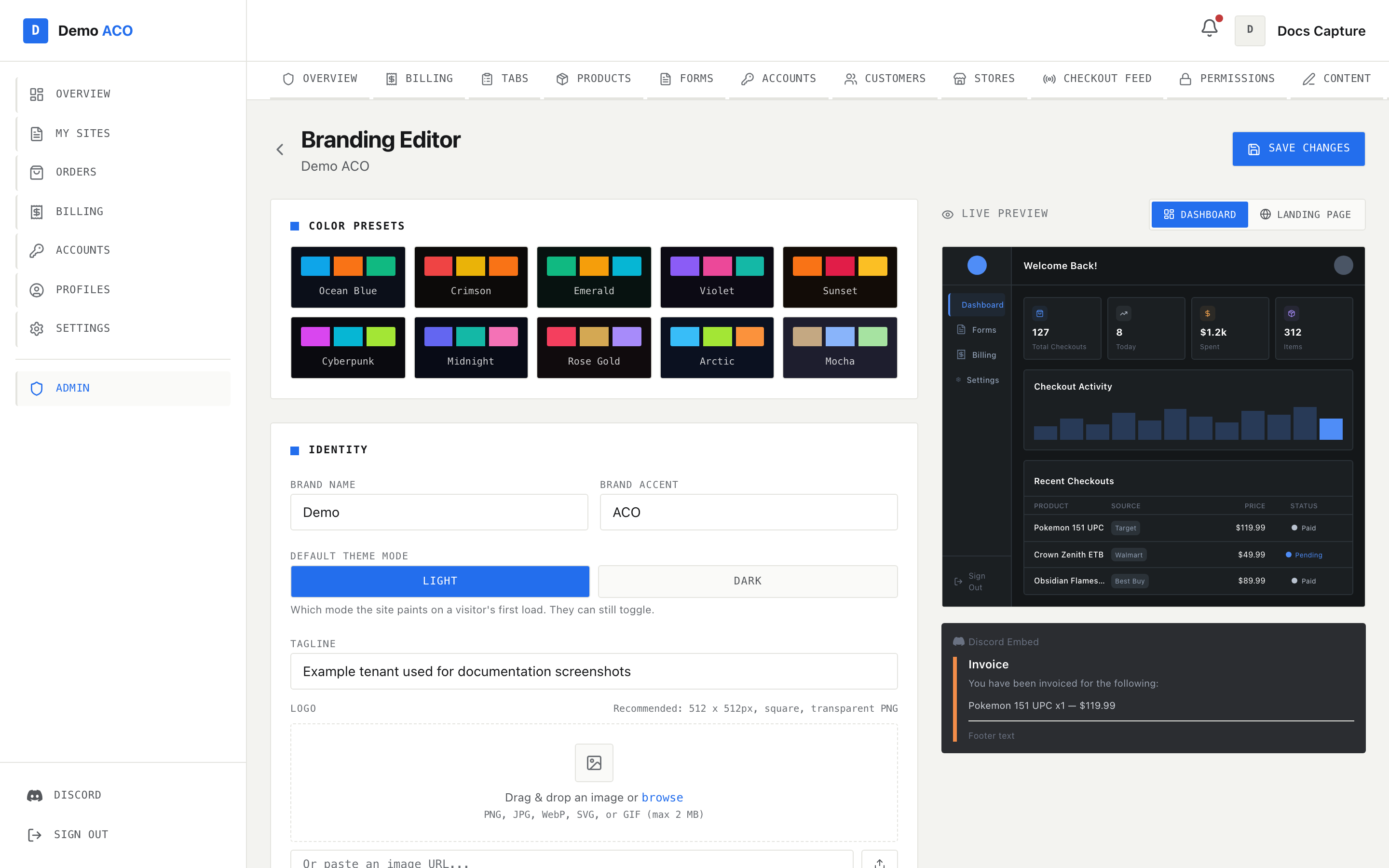
The page is split in two: the editor on the left, a live preview on the right that redraws as you type. Nothing is written until you press **Save Changes** in the top right.

<figure><img src="https://619092889-files.gitbook.io/~/files/v0/b/gitbook-x-prod.appspot.com/o/spaces%2FYF2YIy2qTYyy9j61lr0Y%2Fuploads%2Fgit-blob-cf89cbd87ae18db8c584e111dae5745097d9c8a1%2Fbranding.png?alt=media" alt="The Branding Editor with colour preset swatches, the Identity section, and a live dashboard preview on the right"><figcaption><p>The editor on the left, a live preview on the right. The preview switches between Dashboard and Landing Page, and a Discord embed preview sits underneath it at all times.</p></figcaption></figure>

The **Branding** tab only appears for real tenant admins (and platform operators). An admin who has console access through a Discord role but is not registered as a tenant admin will not see the tab at all — the underlying API rejects that class of admin, so the link is hidden rather than shown and denied.

{% hint style="warning" %}
If the editor cannot read your current branding, it refuses to open. You get an error, a **Retry** and a **Back** button, and no form. That is deliberate: the form would otherwise mount holding factory defaults, and saving from that state would overwrite your live theme with them.
{% endhint %}

## Identity

| Field                  | What it does                                                                      |
| ---------------------- | --------------------------------------------------------------------------------- |
| **Brand Name**         | The first half of your wordmark, drawn in the site's normal text colour.          |
| **Brand Accent**       | The second half, drawn in your accent colour. Optional.                           |
| **Default Theme Mode** | Light or dark — which one a visitor's first load paints.                          |
| **Tagline**            | Used as the site's meta description (search results, link previews).              |
| **Logo**               | The square mark in the sidebar, topbars, landing navbar, footer and sign-in page. |
| **Logo Alt Text**      | Alt text for that mark. Falls back to your full brand name.                       |
| **Favicon**            | The browser-tab icon.                                                             |

### The two-part wordmark

Your name is stored as two halves and rendered as one: `Brand Name` in ordinary ink, a space, then `Brand Accent` in your accent colour. "Demo" + "ACO" renders as **Demo** *ACO*. Leave the accent empty and you get the name on its own — nothing breaks, you just lose the two-tone effect.

The joined name is also what appears in the browser tab title and in the footer's copyright line. If **Brand Name** is empty, the site falls back to the platform's own name, which is almost certainly not what you want.

Without a logo, the square mark is drawn as an accent-coloured tile holding the first letter of your brand name. Uploading a logo replaces it everywhere at once.

### Uploads

Both the Logo and Favicon fields accept a drag-and-drop, a **browse** click, or a pasted URL. The recommendations shown in the editor are 512 × 512 square transparent PNG for the logo and 32 × 32 or 64 × 64 for the favicon. Maximum file size is 2 MB.

{% hint style="warning" %}
The helper text under the drop zone lists SVG, but the server rejects it. Uploads are validated by sniffing the actual file bytes, and the accepted formats are **PNG, JPEG, WebP, GIF and ICO** only — SVG is excluded on purpose, because it is XML and can carry a script payload. An SVG comes back as "Invalid or unsupported image". Convert it to PNG first, or paste a URL to a copy hosted elsewhere.
{% endhint %}

If you upload a logo but leave the favicon empty, the site flies your logo as the favicon. Only if both are empty does it fall back to the platform icon.

### Default theme mode

The **Light / Dark** toggle decides which mode paints on a visitor's first load, before they have touched the theme switch. They can still toggle, and their choice sticks.

This one setting is stored separately from every other field on this page — it lives in the site's own database, while the colours live with your bot. Saving writes both. If the colours land and the mode does not, the page says so explicitly ("Colours saved, but the default theme mode didn't") rather than claiming success.

## Colours

Nine brand colours in three groups, plus three surface colours. Each row has a swatch you can click for a colour picker and a text box you can paste a hex into.

| Field                  | What it drives                                                                                                                                           |
| ---------------------- | -------------------------------------------------------------------------------------------------------------------------------------------------------- |
| **Primary → Main**     | Your accent. Buttons, links, the active nav item, the accent half of the wordmark, section markers, input focus borders.                                 |
| **Secondary → Main**   | The second accent slot: secondary buttons, the "secondary" tag tone, the hero headline underline, alternating step markers.                              |
| **Tertiary → Main**    | The third accent slot: the "tertiary" tag tone and every third step marker.                                                                              |
| **Background**         | The page canvas behind everything.                                                                                                                       |
| **Card**               | Every card and panel surface. Two derived shades (a slightly lifted one, a slightly more lifted one) are computed from it.                               |
| **Border**             | Every hairline rule and divider. A stronger variant is derived from it.                                                                                  |
| **Embed Accent Color** | Lives in the **Discord Embed** section further down, not with the colours above: the coloured bar down the left of the embeds your bot posts in Discord. |

Only the **Main** row of each group drives the live site — and only Main is what the live preview beside the editor draws with. The **Light** and **Dark** rows are written out to a set of older CSS variables the current design no longer reads, so editing them changes nothing you can see, on the site or in the preview. Keep them near the Main colour for tidiness; nothing depends on them.

Leave Secondary or Tertiary unset and those slots simply inherit your accent, so a tenant with one brand colour gets a coherent single-colour palette rather than a stray hue from a stale default.

### Your colour is used as typed

This is the part that recently changed, and it is worth understanding.

A colour you type is used **exactly as typed** whenever it is legible. Only when a colour would fail the WCAG AA contrast bar (4.5:1) against the surface it sits on does the site adjust it — and the adjustment keeps your hue, walks the lightness the minimum distance needed (darker in light mode, brighter in dark mode), and stops the moment it passes.

Two consequences worth knowing:

* A deliberate near-grey stays a near-grey. An earlier version forced a minimum saturation on any adjusted colour, which turned a silver sampled from a logo into a green that appeared nowhere in the brand. Colours below the neutral threshold now only get lighter or darker, never more colourful.
* A dark, perfectly readable brand colour is no longer replaced by a washed-out lighter version of itself. If it clears the bar, you get your hex back.

The legibility check is made against the design's own light and dark card colours, so it is a fixed bar rather than one that moves with a background you have customised.

Two things are never taken from your palette. **Text colour** is derived, not configured: the site picks its light-on-dark or dark-on-light ink set from your background's brightness, then pushes each ink shade until it clears 4.5:1 against your Card colour. And the **status colours** — the green, amber and red used for paid, pending and failed — are locked, so a green brand cannot make a failure look like a success.

### Which mode your palette lands on

You store one palette, but the site has two modes. The palette is applied to whichever mode it actually suits: a dark background lands on dark mode, a light one lands on light mode. The other mode keeps the design's stock surfaces.

{% hint style="info" %}
Your **accent** applies to both modes. Your **surfaces** apply to one. All ten built-in presets are dark palettes, so picking a preset recolours your dark mode and leaves light mode on the stock surfaces with your accent on top.
{% endhint %}

All three surface fields must hold a valid colour for any of them to apply. A partial palette is ignored entirely rather than producing a background that clashes with an unrelated card.

## Colour presets

Ten named palettes — Ocean Blue, Crimson, Emerald, Violet, Sunset, Cyberpunk, Midnight, Rose Gold, Arctic and Mocha — each shown as three swatches on its own background colour. Clicking one overwrites all nine brand colours, all three surfaces and the embed colour in the form. It does not touch your name, logo, favicon or tagline, and it does not save.

A preset shows a check mark in its corner when every one of those thirteen values currently matches it exactly, so you can tell at a glance whether you are on a preset or have edited away from one.

## Discord embed

Three fields that only affect what your bot posts in Discord: the **Embed Accent Color** (the bar down the left edge), the **Footer Text**, and an **Embed Thumbnail** (80 × 80 square PNG recommended). The preview underneath the main preview pane shows a sample invoice embed with all three applied.

{% hint style="warning" %}
These fields only do something if your tenant's bot is actually running. The bot logs into Discord with the **Bot Token** from your Discord application's Bot tab — a different tab from the Client Secret. A tenant that supplied only a Client ID and Client Secret gets a site that works perfectly and a Discord server with no bot, so nothing ever posts an embed to style. See [Your Discord application](/acoservice-documentation/setting-up-your-tenant/discord-application.md).
{% endhint %}

## Saving

**Save Changes** writes the colours and images to your bot, then writes the default theme mode, then clears the site's tenant cache so the new look is picked up. A green **Saved** tag appears for a few seconds; failures show the real reason from the server rather than a bare status code.

The site caches tenant configuration for about a minute, so give a page a reload after that if it still looks the same.

## Related

* [Landing page content](/acoservice-documentation/for-tenant-admins/content.md) — the words on your landing page, separate from its colours.
* [Settings](/acoservice-documentation/for-tenant-admins/settings.md) — server linking, form URLs and the security log channel.


---

# Agent Instructions
This documentation is published with GitBook. GitBook is the documentation platform designed so that both humans and AI agents can read, navigate, and reason over technical content effectively. Learn more at gitbook.com.

## Querying This Documentation
If you need additional information that is not directly available in this page, you can query the documentation dynamically by asking a question.

Perform an HTTP GET request on the current page URL with the `ask` query parameter, and the optional `goal` query parameter:

```
GET https://acoservice.gitbook.io/acoservice-documentation/for-tenant-admins/branding.md?ask=<question>&goal=<endgoal>
```

`ask` is the immediate question: it should be specific, self-contained, and written in natural language.
`goal` is optional and describes the broader end goal you are ultimately trying to accomplish on behalf of the user. GitBook uses it to tailor the answer towards what is most useful for that goal.

The response will contain a direct answer to the question and relevant excerpts and sources from the documentation.

Use this mechanism when the answer is not explicitly present in the current page, you need clarification or additional context, or you want to retrieve related documentation sections.
